In a perfect city, every time a passenger steps out of a taxi, a new passenger would be standing right there, waiting to get in. There would be zero “deadhead” miles—miles driven by an empty car to reach a new fare.
But New York City is a vibrant place like many big cities. It has a morning commute, a lunch rush, and a nightlife. These rhythms create massive imbalances between Supply (where taxis end up) and Demand (where passengers are waiting).
I wanted to measure this inefficiency using Optimal Transport (OT) theory. Not for a single driver, but for the entire city system of yellow taxis. The NYC taxi dataset has millions of data points, so it is perfect for a research study.
Database issues: PostgreSQL, TimescaleDB or PySpark?
I started this project using standard PostgreSQL. It worked fine for exploring small samples, but as soon as I tried to run time-series analysis over millions of rows, I hit a wall. Part of the work required running many queries that has a filter clause like this. There potentially could be thousands of such queries for intervals from 2015 to 2017 for pickups and dropoffs, and even intervals that slightly overlap:
1
... WHERE pickup_datetime BETWEEN '2016-01-15 08:00' AND '2016-01-15 08:15'
In vanilla Postgres, querying a specific 15-minute window in a massive dataset meant scanning massive B-Tree indexes repeatedly. TimescaleDB provided a massive performance boost for this exact type of data structure.
It is important to note that for a single month of data (~10 million rows), vanilla PostgreSQL is actually quite capable. Queries return in seconds, and the difference is negligible.
However, the NYC Taxi dataset is deceptive. A single year contains roughly 130 million rows. If you want to analyze a 5-year trend, you are suddenly dealing with over 600 million rows. It may take hours to do an analysis with vanilla PostgreSQL.
For example, some simple benchmarking the aggregation speed of a complex time-bucket query gives me:
1
2
TimescaleDB:  6.48 sec
Vanilla PG:  21.06 sec
When you compound this over thousands of iterative queries (essentially time-series workloads) needed for the Optimal Transport analysis, TimescaleDB made the work feasible.
How about PySpark?
PySpark is an alternative, but it comes with some complexity. I would need to use a library to work with geospatial data. Filter data for a 15 minute interval will not be any faster with PySpark. I do use PySpark for analysis downstream.
The Theory: Optimal Transport
To measure inefficiency, I used a concept called the Wasserstein Distance (or Earth Mover’s Distance).
Limitations
We note that the limitation is that the distance between point A and B is just the length of the line connecting the two points. We do not worry or deal with paths that traverse real streets and roads.
The Theory: Optimal Transport (continued)
Imagine the empty taxis are piles of dirt, and the waiting passengers are holes. Optimal Transport calculates the minimum possible effort required to move all that dirt into the holes.
- Low Score (Efficient): The dirt is right next to the holes. (Taxis drop off next to new passengers).
- High Score (Inefficient): The dirt is on the other side of town. (Taxis drop off in Wall St, but passengers are in Harlem).
A normal workday
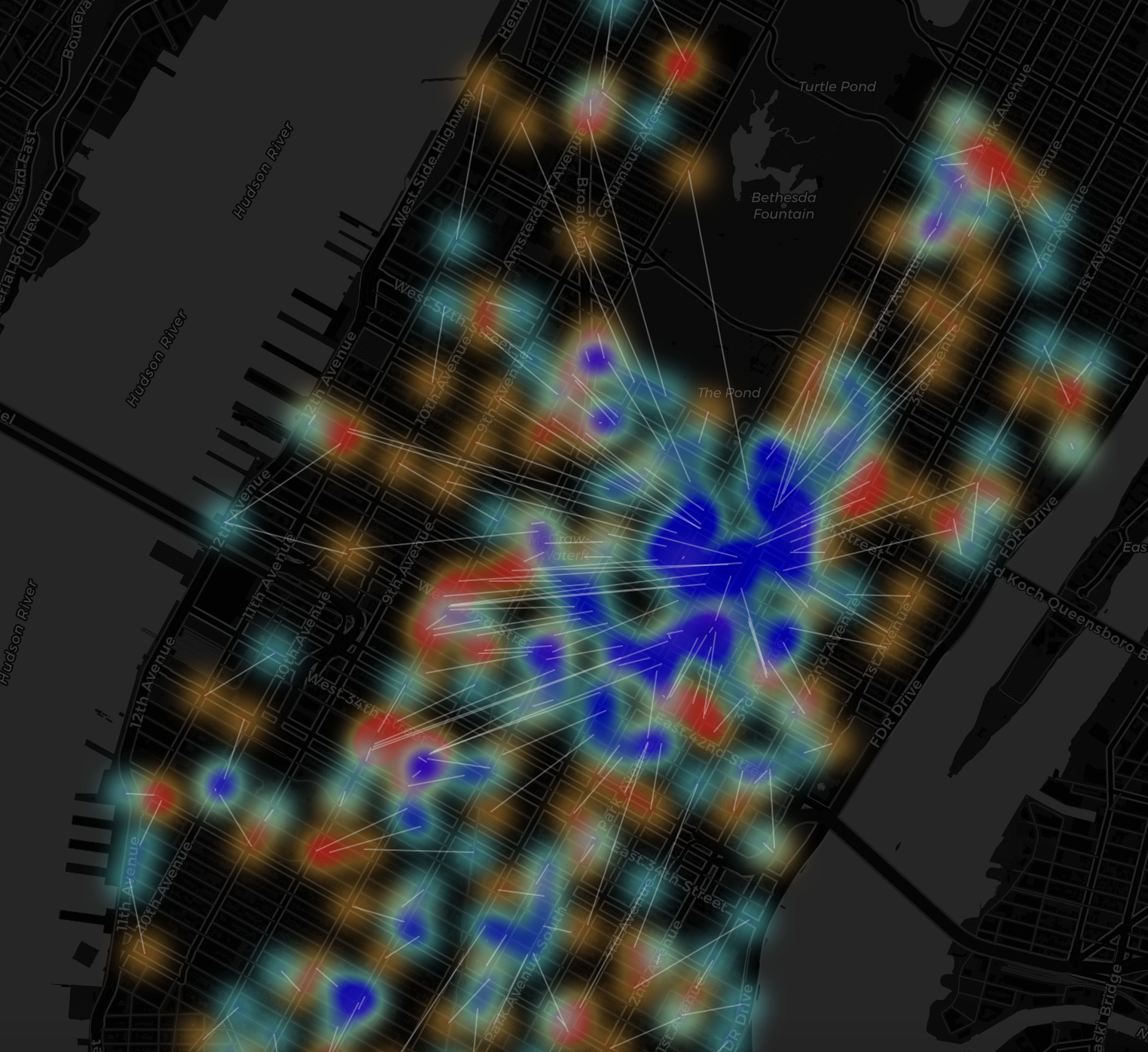
For the above, what’s noticable is the uniformity, where white lines stream in one direction– thousands of taxis are converging on the business district to drop off commuters.
A weekend
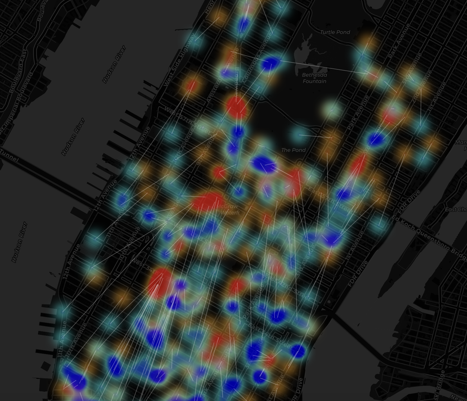
Unlike the morning rush, where all the Blue (Supply) was trapped in Midtown, look at how scattered the Blue and Red blobs are here. They aren’t flowing in one direction anymore. They are crisscrossing each other constantly, forming “X” shapes all over the map.
An anomaly
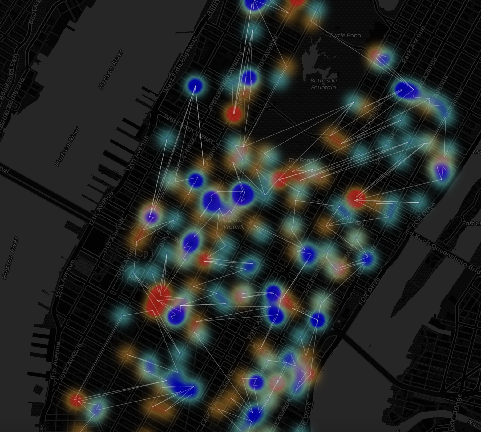
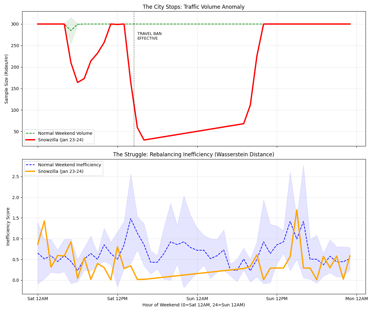
This map captures the exact moment the New York City taxi network collapsed, just 30 minutes before the total travel ban was enforced. This map is mostly empty black space. Long white lines shows a rescue mission.
Heartbeat
When I ran this analysis over the entire month of January, a distinct “heartbeat” emerged. This chart shows the average inefficiency score by hour of the day.
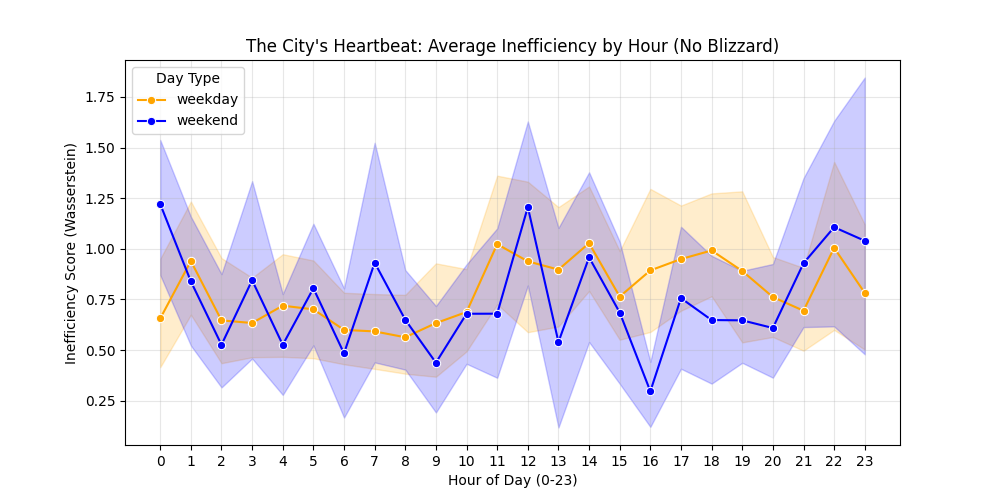
For this time frame, the rigid requirements of the work week create acute spikes of inefficiency during rush hours, as the entire fleet is forced to reset its position simultaneously. However, the random, free-flowing nature of weekends actually creates higher inefficiency during mid-day and late-night hours, likely because demand is scattered across the city (parks, museums, bars) rather than concentrated in business districts, making it harder for taxis to chain trips together.
The 2016 Blizzard (The Weekend 2 PM Anomaly)
The chart shows the chaos peaking exactly at 14:00 (2 PM) as the city shut down and the few remaining cars were completely disconnected from the desperate demand.